How We Crafted a Visual Identity for Recovery.com


Andrew De Stadler is the Senior Vice President of Marketing at Recovery.com, where he leads compassionate, data-driven initiatives to connect people with trusted mental health and addiction care. With more than 14 years of experience at mission-driven organizations like Google and Veterans United, Andrew blends creativity, analytics, and empathy to make Recovery.com a household name in behavioral healthcare.


Andrew De Stadler is the Senior Vice President of Marketing at Recovery.com, where he leads compassionate, data-driven initiatives to connect people with trusted mental health and addiction care. With more than 14 years of experience at mission-driven organizations like Google and Veterans United, Andrew blends creativity, analytics, and empathy to make Recovery.com a household name in behavioral healthcare.
In 2023 we hit a crossroads as a company. Rehabpath was our name since the company was founded in 2017 but it no longer captured who we were or what we wanted to become. The word “Rehab” in the name was too limiting as rehab is a small part of a patient’s lifelong recovery journey. Plus, behavioral healthcare needs are wide ranging and most people looking for treatment aren’t looking for rehab. So we decided to rebrand to Recovery.com to better serve everyone looking for mental health treatment.
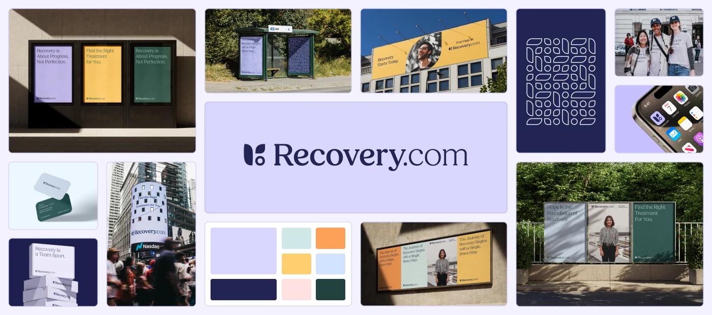
What our new name needed was a visual identity to match. We wanted it to celebrate the humanity and positivity that comes with finding and experiencing recovery.
To start the process we brought together key members of our team along with our design and marketing partners at Denada & Unlock Health. We needed to define who we wanted to be. To start, we narrowed down a list of terms that told the story of our new direction to four: hope, growth, connection & calm.
These terms capture what we strive to offer people seeking treatment. It could be a person in the darkest moment of their life who desperately needs a glimpse of hope. Or someone who has been stagnant in finding recovery and is seeking growth. Perhaps it is someone who is in a truly lonesome space and is craving connection. Or maybe it is the loved one of someone struggling who needs a moment of calm as they search for an answer.
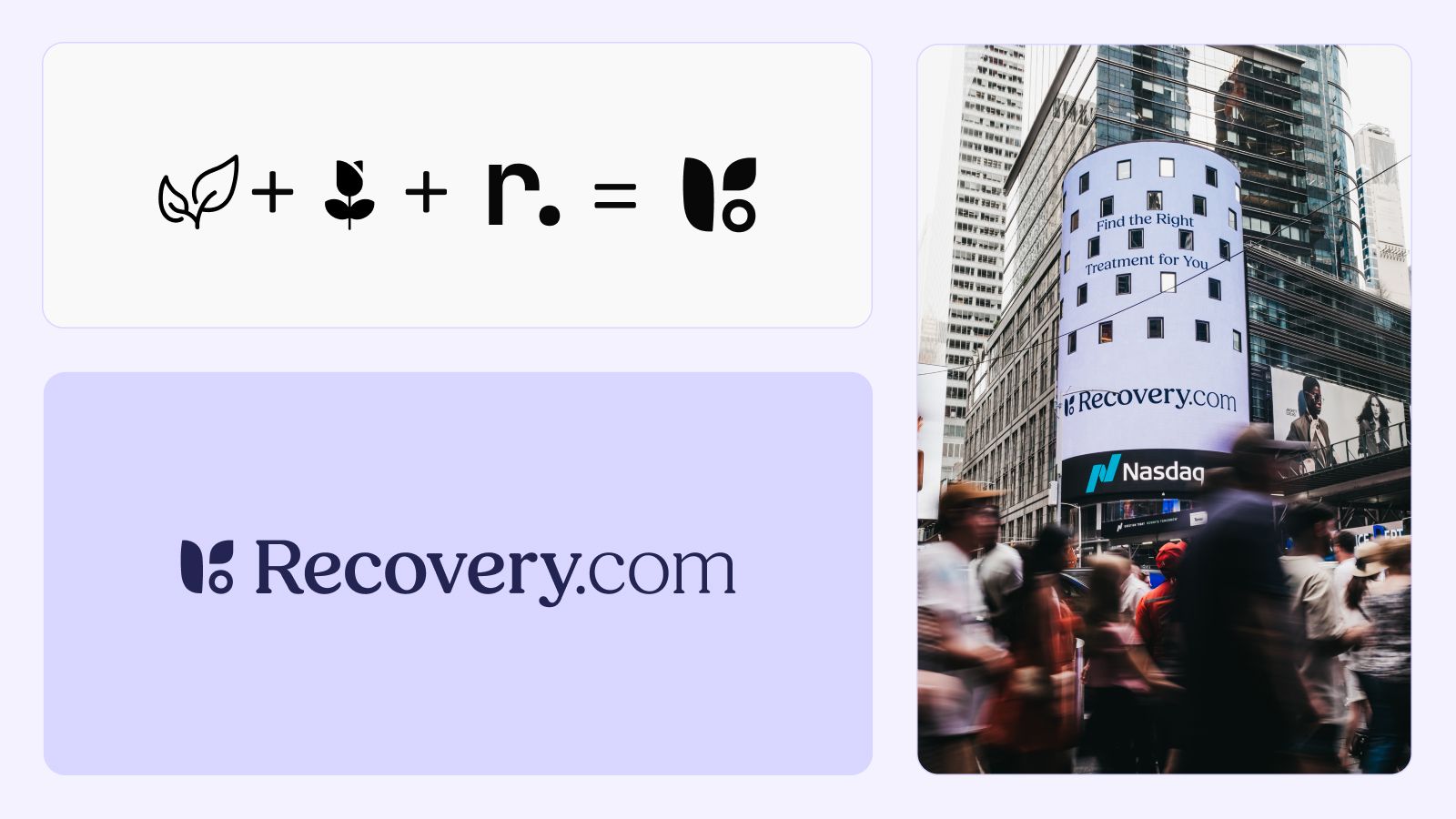
With these terms defined, we began crafting the visual identity. It started with endless sketches but eventually, we identified a concept that had a certain spark. We created three logo concepts but just kept coming back to one particular sketch that felt special. That mark is a mixture of the essence of a flower blooming and the form of an “r” and a dot to represent our identity as recovery.com.
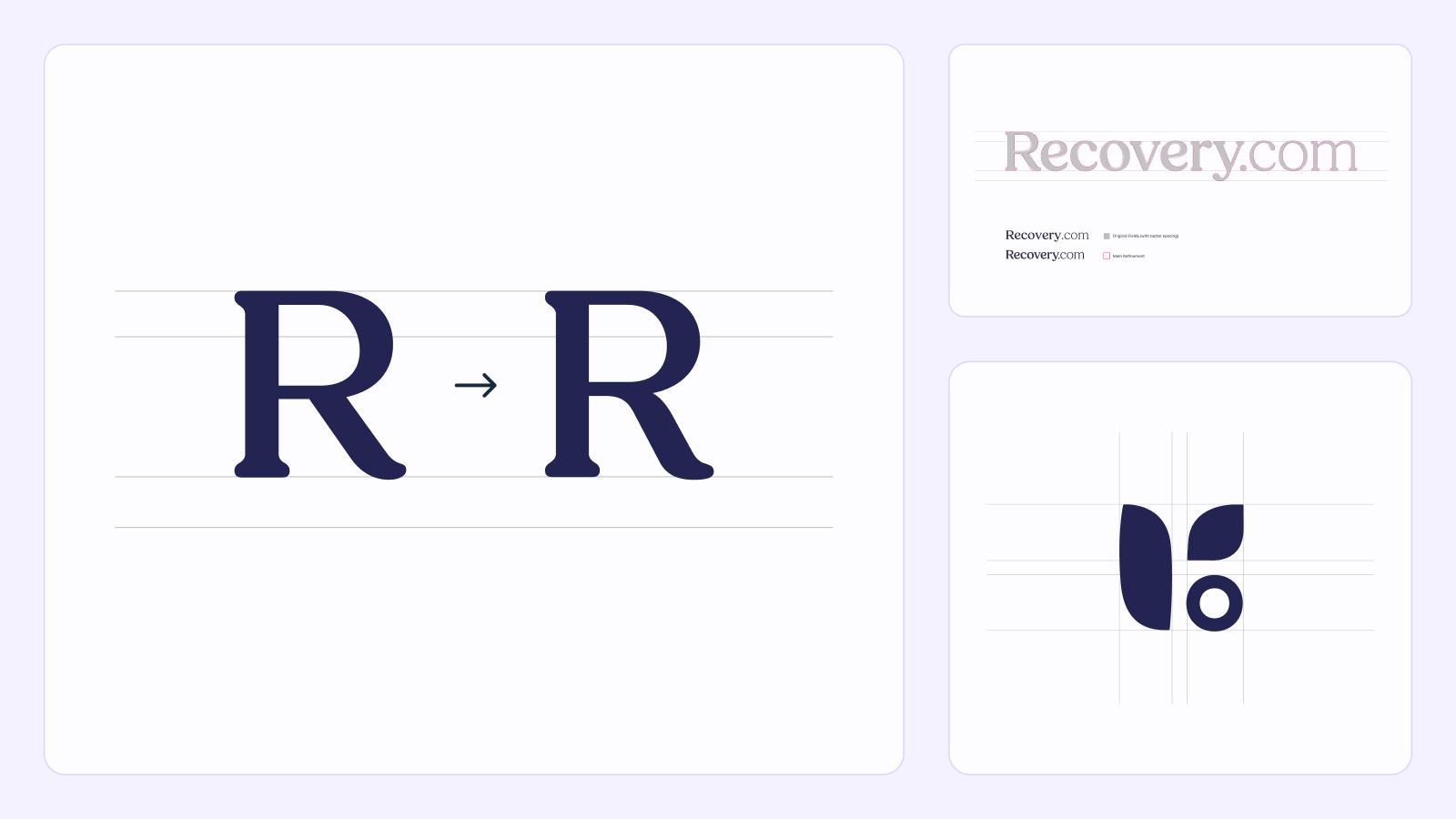
We knew we had to get the typography right because recovery.com is not just our domain name but also the name of our company. So we made sure to put the visual focus of the typography on the word recovery. We also wanted to impute a sense of hope and humanity into the typeface. In the past, our product and branding had only used sans serif typefaces which offered a clean aesthetic but we were finding that it was starting to have a slightly cold digital feel. We wanted the next stage of our identity to have a certain warmth and hope to it. We decided the best way to add these qualities would be to add a serif font to our typography ensemble. After a long search, we found a warm serif typeface that wasn’t overly sharp or rigid and offered rounded edges and a certain youthfulness to the strokes. We brought in the professionals from Reset typography studio (whose team has helped major brands like Adobe, Google, and Pentagram) to add subtle notes of hope throughout the characters of the wordmark. A few key places this can be specifically seen is in the down stroke of the “R” that evolved from a sharp diagonal line to a gentle downward curve, as well as the “e”s that have a subtle upward lift. Little touches like these, while not overly loud, contribute to an overall feeling of hope and comfort when observing the mark.
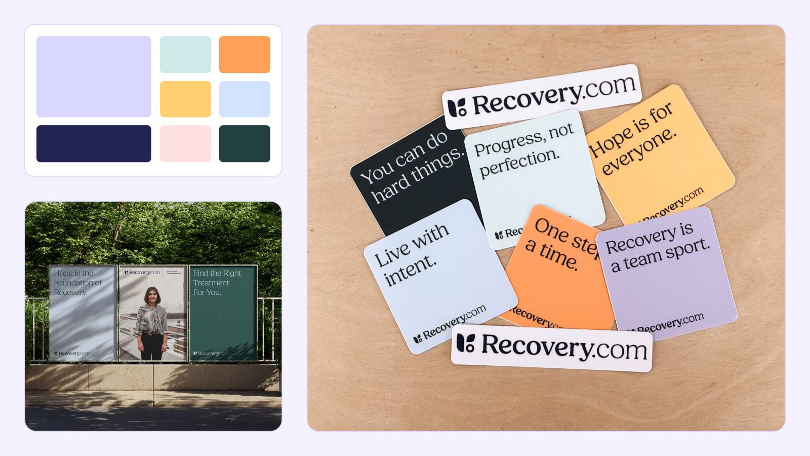
Lastly, we knew a key characteristic of our new identity would be color. We wanted to celebrate the abundant hope of the word recovery through a vast array of bright colors. Our palette consists of blue, seafoam, orange, yellow, and pink as well as our primary brand color of purple. Bringing in darker values of our colors offers the ability to create contrasting compositions that stand out. Our intention with our new approach to color was not for the observer to walk away from our brand with one main color in their mind, but that they would leave with the perception of an optimistic array of colors that build the idea of what recovery can bring. One of our favorite applications of this color scheme is on our stickers that we bring with us to every conference we go that champion positive messaging dressed in our new color palette. The best feedback we get is when we see those fly off our sponsor table.
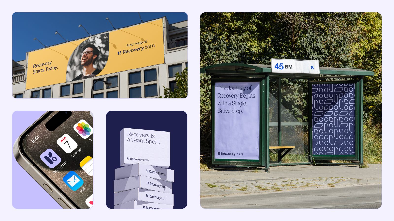
Crafting a visual identity for Recovery.com allowed us to step further into the shoes of those seeking a life in recovery. We gained empathy for how difficult it can be to find treatment and also found an even deeper appreciation for just how much joy and peace life in recovery can bring. We hope that we’ve created a look and feel that is welcoming and makes people believe that recovery is possible for them.
Our Promise
How Is Recovery.com Different?
We believe everyone deserves access to accurate, unbiased information about mental health and recovery. That's why we have a comprehensive set of treatment providers and don't charge for inclusion. Any center that meets our criteria can list for free. We do not and have never accepted fees for referring someone to a particular center. Providers who advertise with us must be verified by our Research Team and we clearly mark their status as advertisers.
Our goal is to help you choose the best path for your recovery. That begins with information you can trust.


